HEY! I’M RISVA
I’M A GRAPHIC & UI/UX & WEB DESIGNER
I create clean, meaningful, and visually engaging designs that turn ideas into user-friendly digital experiences.

Who actually am I?
I’m passionate about designing websites, mobile apps, brand identities, social media creatives, posters, and marketing materials. I enjoy exploring new concepts, solving design challenges, and paying attention to the little details that make every design feel complete.
I’m always curious to learn, experiment, and improve my skills. I believe good design is not just about looking beautiful — it should communicate clearly, solve problems, and create a meaningful experience.
Tools & Software


Table Of Content
UI/UX Case Study
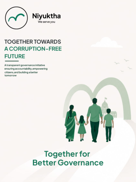
Niyuktha
We serve you
A citizen-focused
Governance Ecosystem
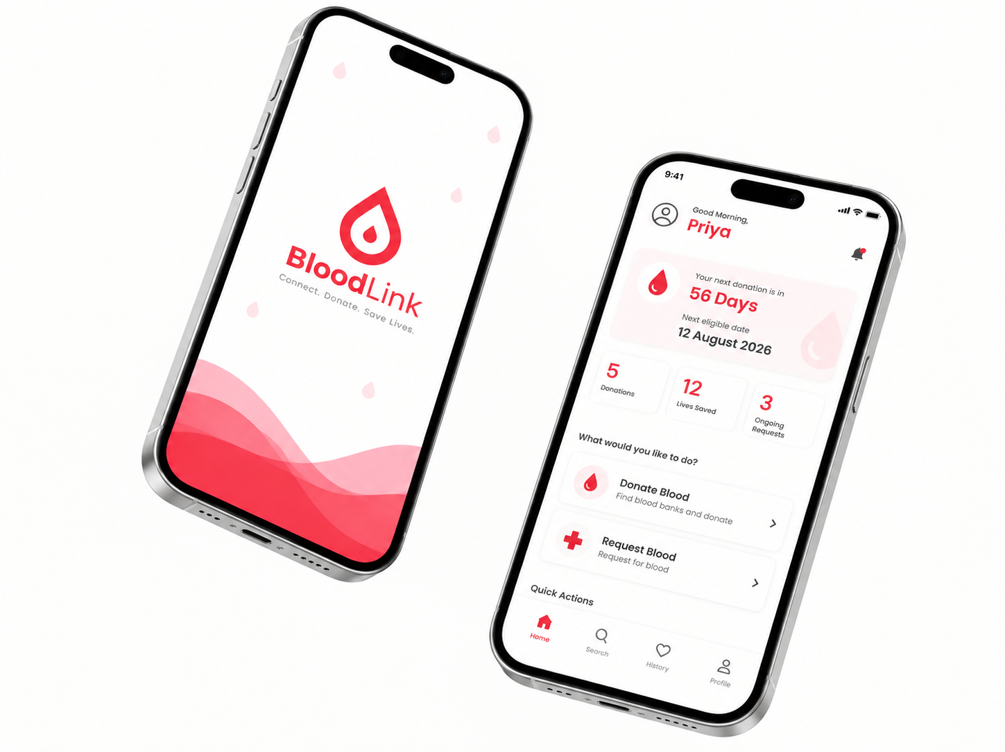
Blood Link
Connect. Donate. Save Lives
A user-friendly
Blood Donation App
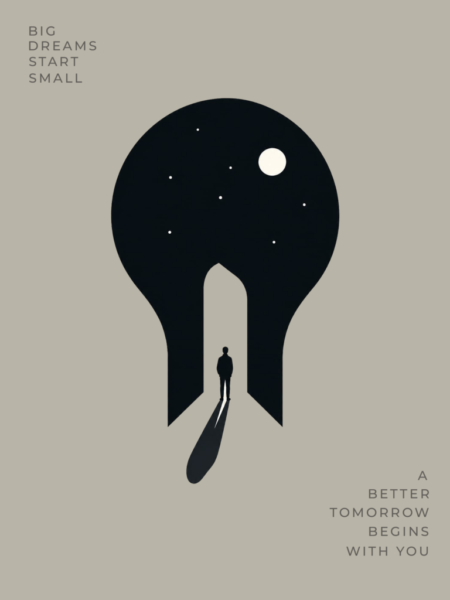
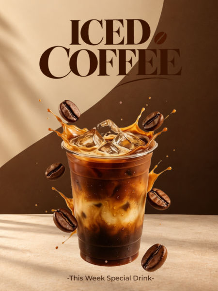
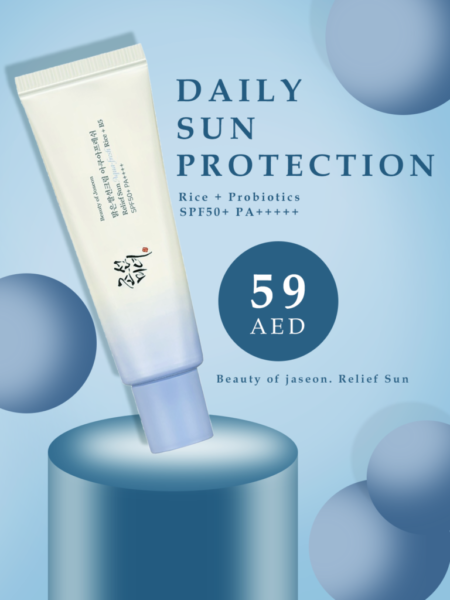
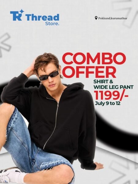
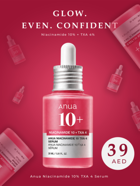
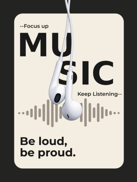
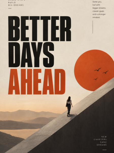
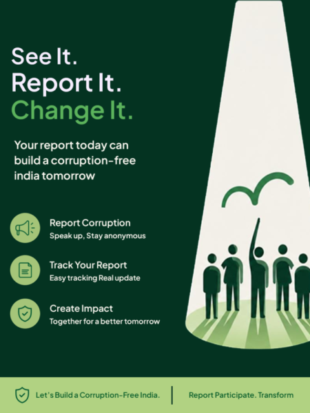
POSTERS


Logofolio
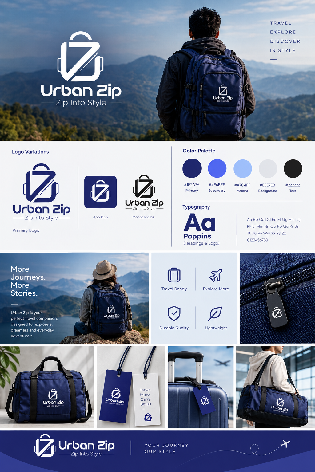
Urban Zip
Urban Zip is a fictional travel bag brand created for people who love travelling, exploring new places, and enjoying every journey. The brand focuses on creating a modern and stylish travel experience with bags that are practical, comfortable, and suitable for everyday adventures.
The logo combines a simple travel bag symbol with a bold and modern style, representing movement, travel, and urban life. The tagline “Zip Into Style” reflects the brand’s idea of making travel more convenient while keeping it fashionable and youthful.


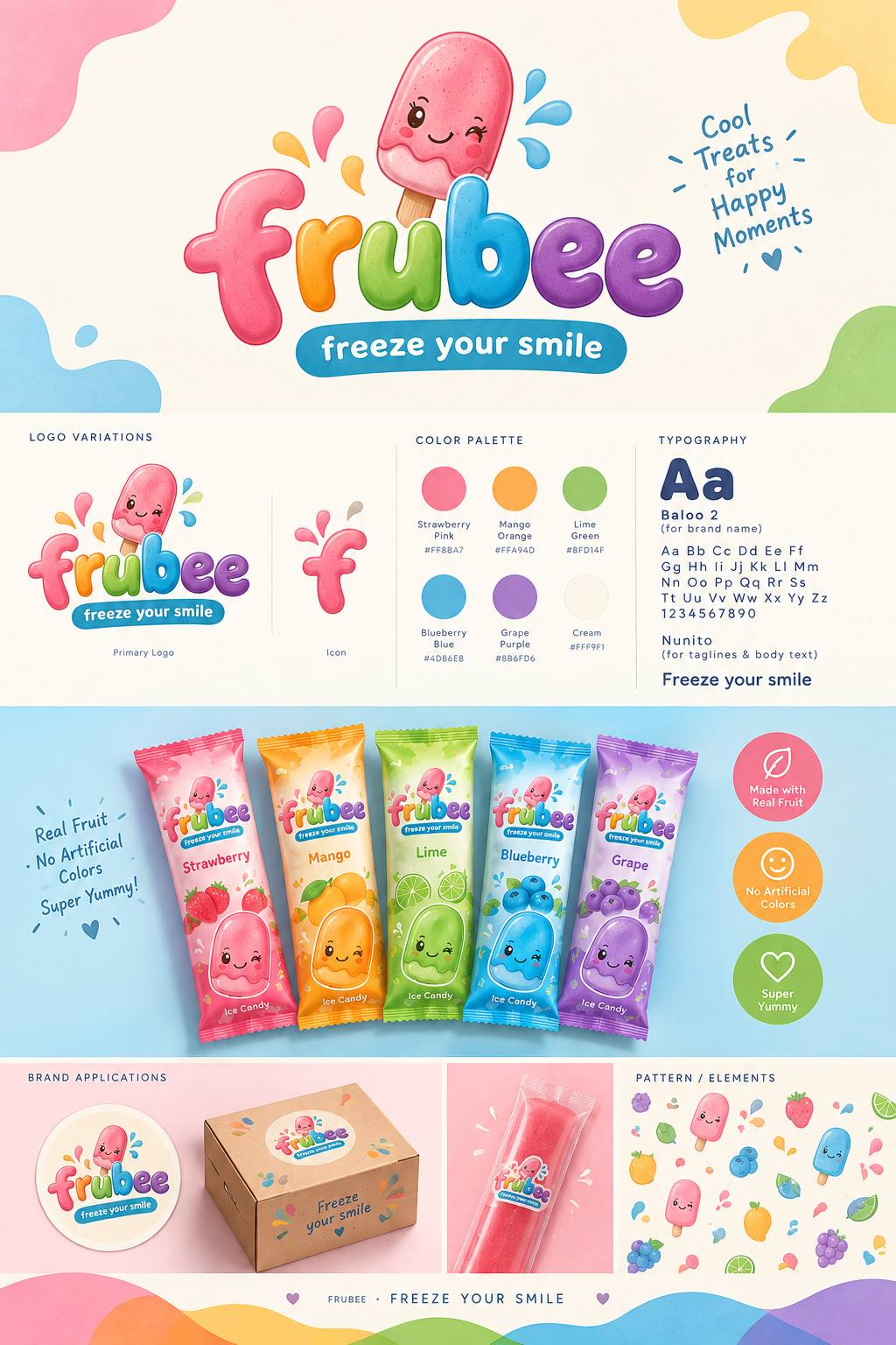
Frubee
“Frubee” is a fictional ice candy bar brand created with a fun, fresh, and youthful personality. The brand is designed for people who enjoy simple moments of happiness and refreshing fruity flavours. Frubee aims to make every bite feel playful, colourful, and enjoyable.
The logo combines a friendly and playful visual style to reflect the cheerful nature of the brand. The overall identity is kept simple, vibrant, and easy to remember, making Frubee feel approachable and suitable for a young, fun-loving audience.
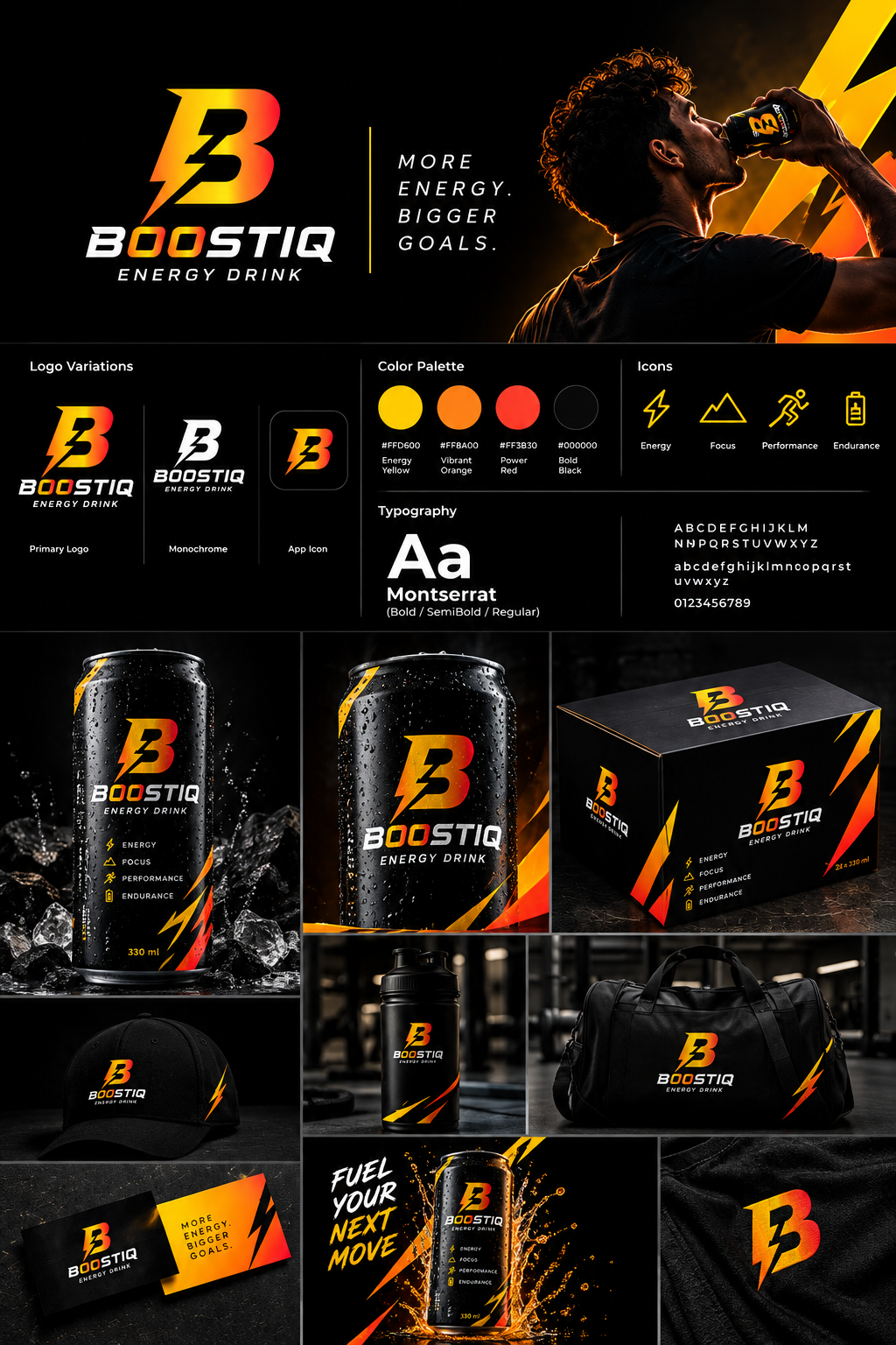
Boostiq
BoostIQ is a fictional energy drink brand created for people who enjoy an active, energetic, and fast-paced lifestyle. The brand is designed to represent energy, motivation, and confidence, making it suitable for people who want to stay active and keep moving throughout the day.
The logo uses a bold lightning-inspired “B” symbol to communicate power, speed, and energy. The yellow, orange, and red gradient adds a vibrant and dynamic feel, while the strong typography gives the brand a sporty and modern personality.


Charmed by Crochet
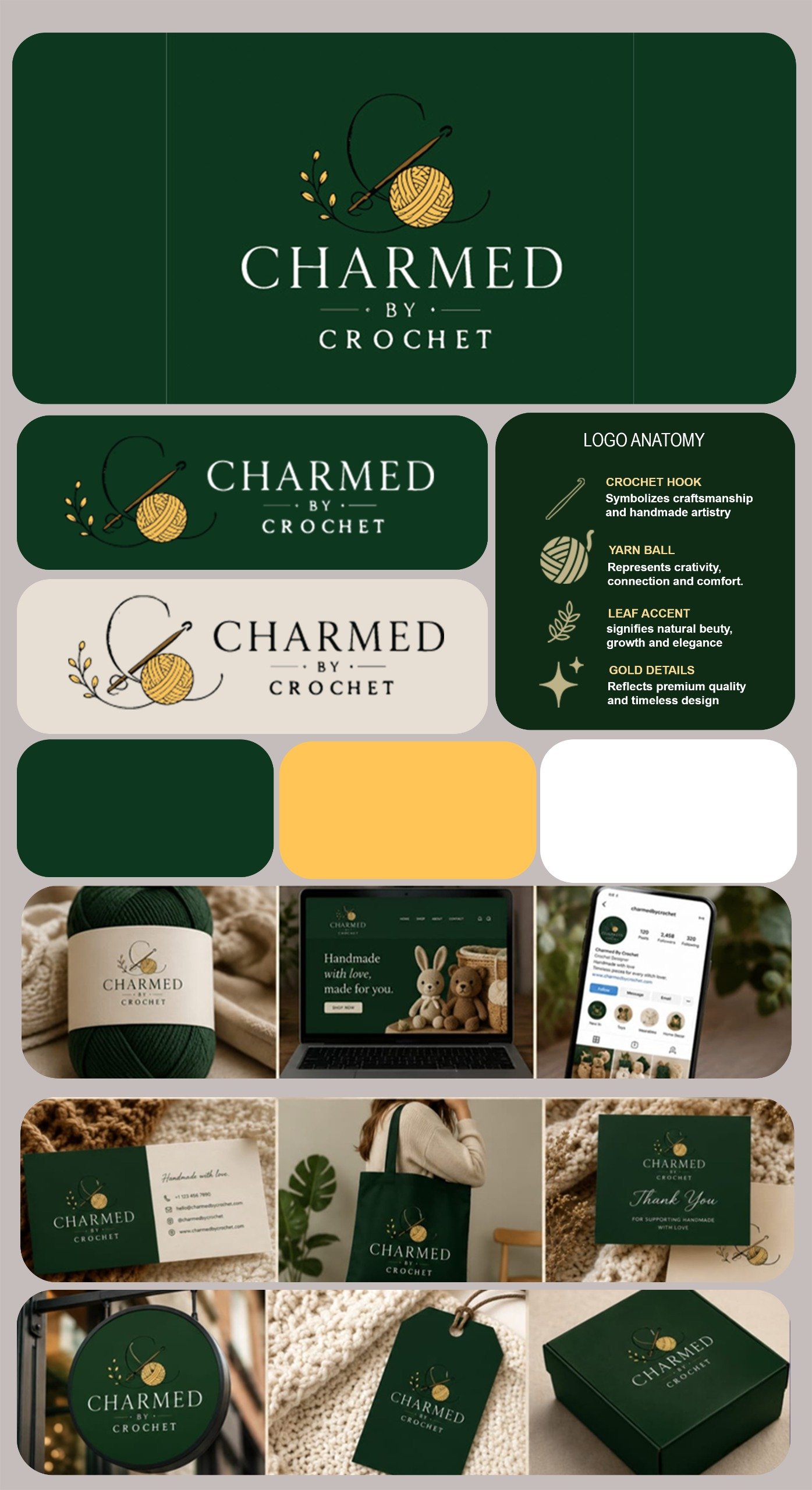
Charmed by Crochet is a fictional crochet shop brand created for people who enjoy the art of crocheting, handmade crafts, and creating beautiful things by hand. The brand celebrates creativity, patience, and the personal touch that makes every handmade piece special.
The logo combines a crochet hook, yarn ball, and delicate leaf elements to represent craftsmanship, creativity, and natural beauty. The elegant typography and warm green and gold colours give the brand a cozy, handmade, and premium feel, making Charmed by Crochet a welcoming identity for crochet lovers and craft enthusiasts.
Little Heaven
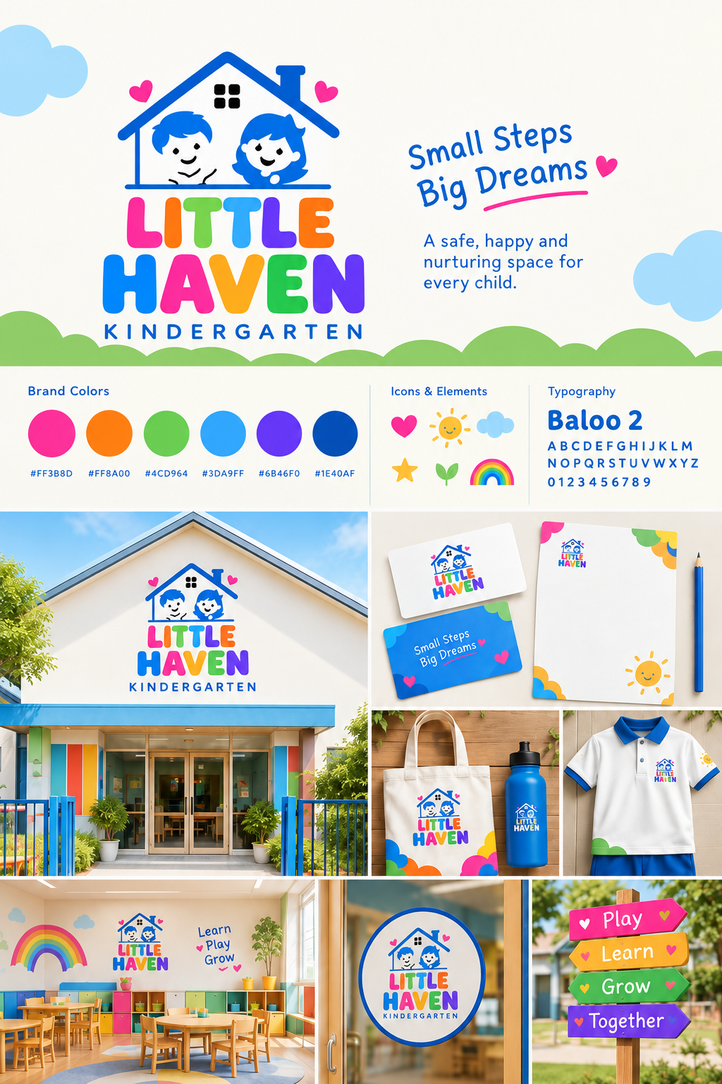
Little Haven is a fictional kindergarten brand created to provide a safe, happy, and welcoming space for young children. The brand focuses on making early education enjoyable through playful activities, creative learning, and opportunities for children to build important social and everyday skills.
The visual identity uses bright, cheerful colours and a friendly logo featuring a house and children, representing safety, care, and a sense of belonging. The playful design creates a warm and positive personality for the brand, making Little Haven feel like a happy place where children can learn, play, and grow.

Package Designs
Three packaging projects, three different product categories, visual styles and brand personalities.

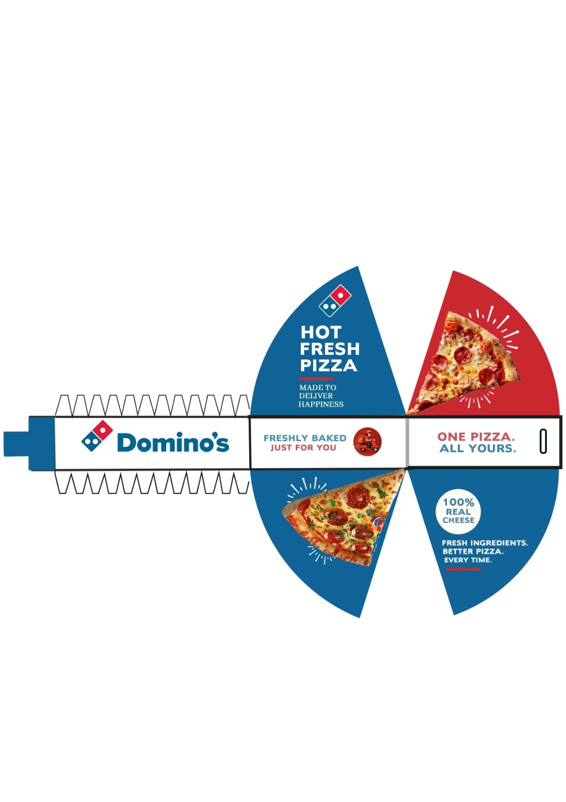
What if a single slice had it’s own box?
A conceptual Domino’s packaging redesign built for convenience, portability, and a better grab-and-go experience.Sometimes, the biggest ideas come in the smallest packages.
**Domino’s Pizza** is a well-known pizza brand created for people who love delicious, freshly made pizza and enjoyable food moments. This concept package design focuses on creating a fun and appealing experience for pizza lovers while keeping the brand’s energetic and recognizable personality.
The package uses the familiar **blue, red, and white** colour combination along with bold typography and a pizza image to create a strong visual identity. The triangular shape is designed to match the pizza slice, making the packaging both functional and visually interesting.
Dreamora sleeping spray
**Dreamora** is a fictional sleep and aromatherapy brand created for people who want to create a calm and relaxing bedtime routine. The brand focuses on helping users unwind after a busy day and enjoy a peaceful atmosphere before sleep through a gentle, soothing experience.
The packaging uses deep purple tones, soft floral illustrations, and elegant typography to communicate calmness, relaxation, and comfort. The combination of lavender-inspired visuals and a clean layout gives **Dreamora** a peaceful and premium personality, making the brand feel suitable for a relaxing nighttime routine.


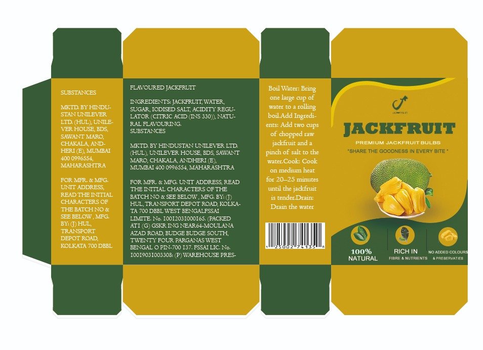
What if Jackfruit had its own premium package?
**Jackfruit** is a fictional food packaging concept created for people who love the unique taste and natural goodness of Kerala’s traditional jackfruit. The brand focuses on bringing the rich flavour of ripe jackfruit to customers in a convenient and attractive package while celebrating the fruit’s natural and local identity.
The packaging uses **green and yellow** to represent freshness, nature, and the vibrant colour of jackfruit. The clean layout, fruit imagery, and natural visual elements create a simple and traditional look while giving the product a fresh and modern feel.